Example Dashboard
Welcome to our step-by-step guide on creating an overview report dashboard in Analyzee. In this example, we'll walk you through the process of building a custom dashboard that provides a comprehensive overview of key metrics and performance indicators for your organization.
Before we begin, let's outline the objectives of our overview report dashboard. Our goal is to create a centralized dashboard that displays essential metrics across different areas of our business, such as sales, marketing, and finance. This dashboard should provide a quick snapshot of performance and enable stakeholders to identify trends and make informed decisions.
Next, we'll identify the data sources required to populate our dashboard. These may include sales data from our CRM system, marketing campaign data from our marketing automation platform, and financial data from our accounting software. In this example walkthrough, we will use the official analyzee data source.
Now, let's dive into the step-by-step process of creating our overview report dashboard:
Step 1: Accessing the Dashboard Interface
Navigate to the Dashboard section of the Analyzee platform. If you're not already logged in, enter your credentials to access your account.
Step 2: Creating a New Dashboard
Click on the "Add Dashboard" button to create a new dashboard. Since we're building an overview report dashboard, we'll name it "Company Overview Report" and click "Save". We do not have any elements to add to our dashboard just yet, so let's move on to the next step.
Step 3: Building Queries
To be able to add visualizations to our dashboard, we need to create queries that fetch the relevant data. Navigate to the "Queries" tab and click on "New Query" to access the SQL Editor.
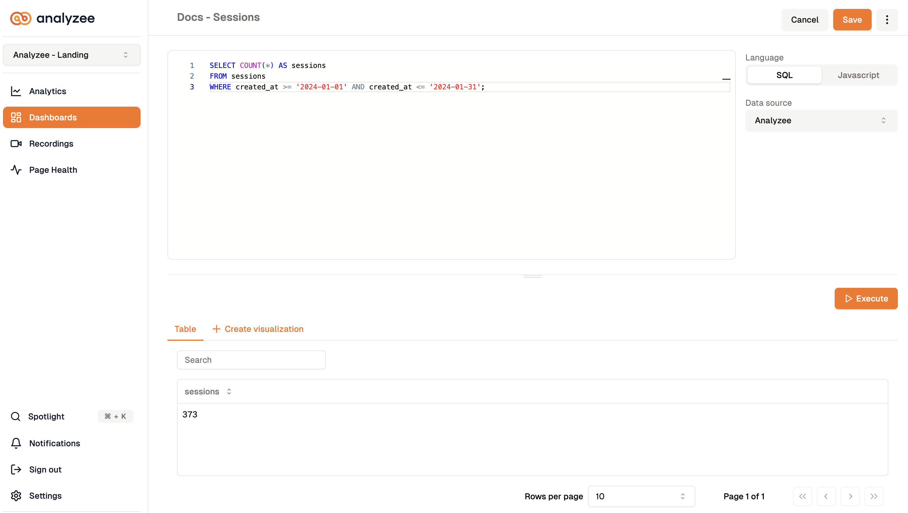
Query #1: Number of Sessions on the Website
Let's start by creating a query that retrieves the number of sessions on our website over the past month.
SELECT COUNT(*) AS sessions
FROM sessions
WHERE created_at >= '2024-01-01' AND created_at <= '2024-01-31';
We will select the data source "analyzee" and name the query "Docs - Sessions". Click on "Execute" to execute the query and view the results. The only visualization we have at this point is the query results table. Don't forget to save the query for future use.
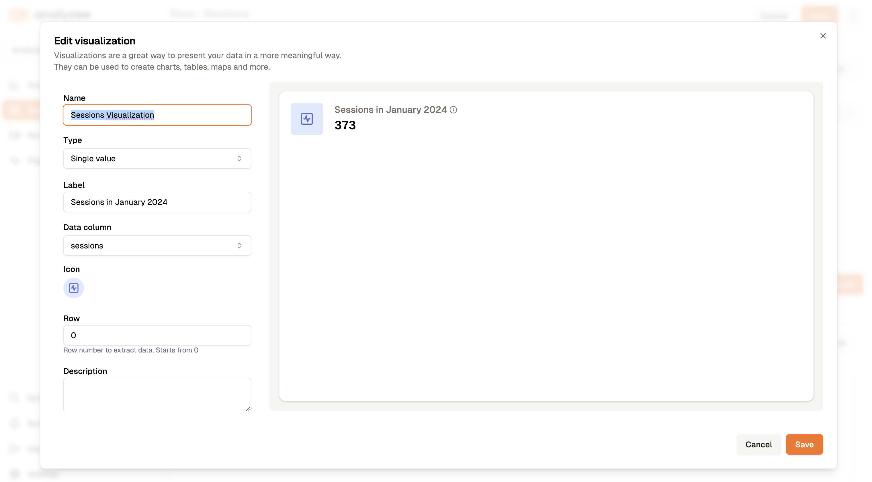
How can we visualize this data? Let's create a simple number visualization that displays the total number of sessions. Select the "Single Value" visualization type and name it "Sessions visualization". Set a label and an icon for the visualization. The data column should be "sessions" as it is the single value we want to show.
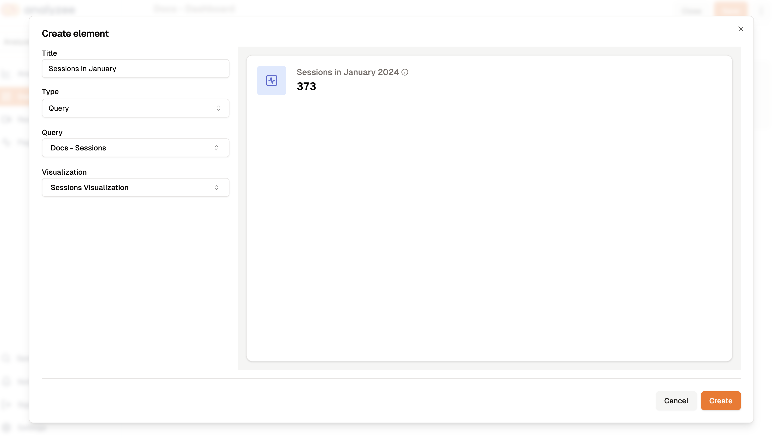
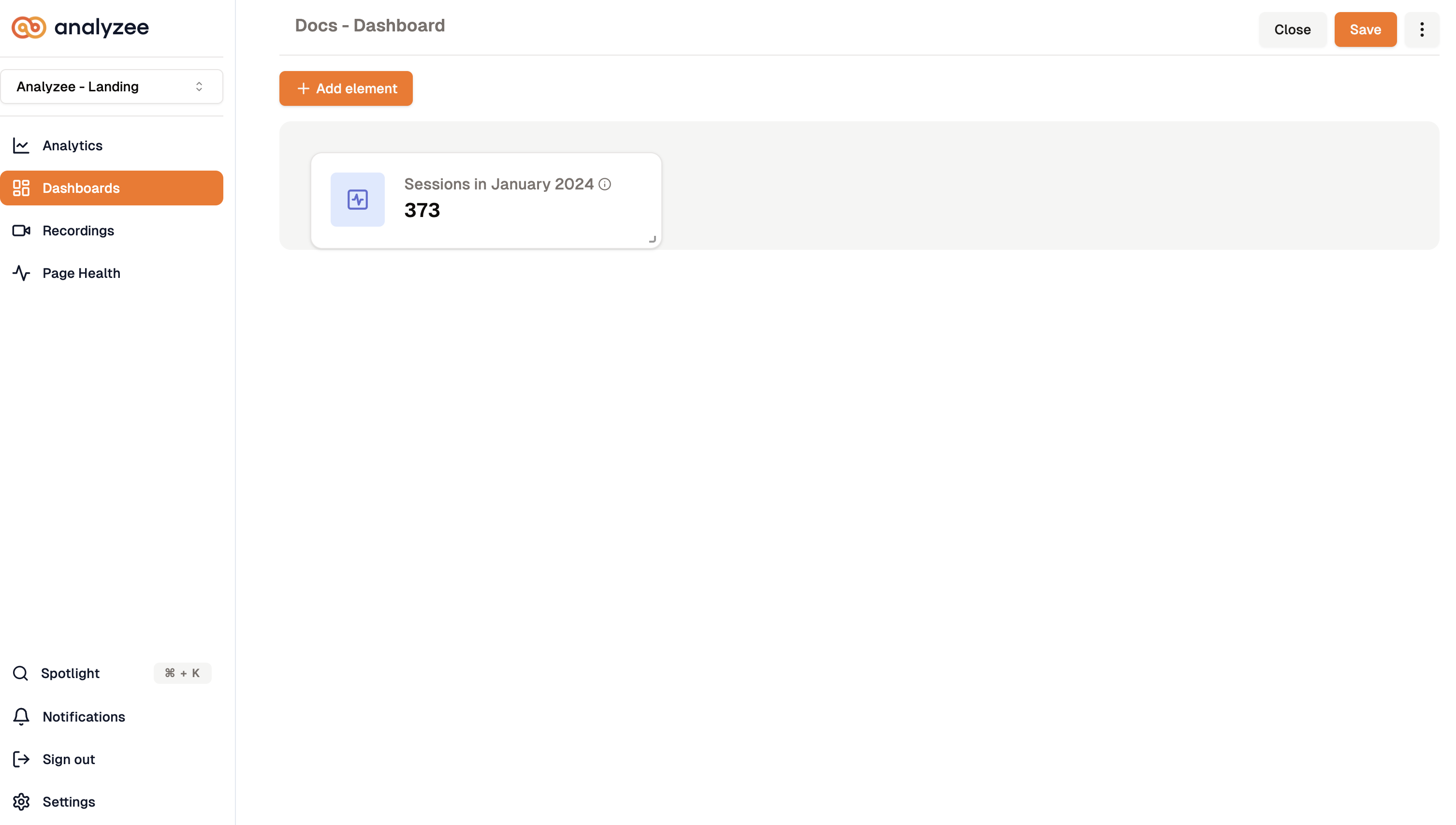
We can now add this visualization to our dashboard. Go back to the previously created dashboard and click on "Add Element". The query we created earlier should be available in the list of queries. Select the "Docs - Sessions" query and select the "Sessions visualization" from the list of available visualizations. A preview will appear on the right, click "Create" to add the element.
 |  |
|---|---|
| Create a new dashboard element | Our dashboard after adding the new element |
Query #2: Referral Sources
Now, let's analyze the top referral sources driving traffic to our website.
SELECT referrer.host as Referrer, COUNT(referrer.host) as Sessions FROM sessions
GROUP BY Referrer
For this query, we'll create a simple Table visualization to display the top referral sources.
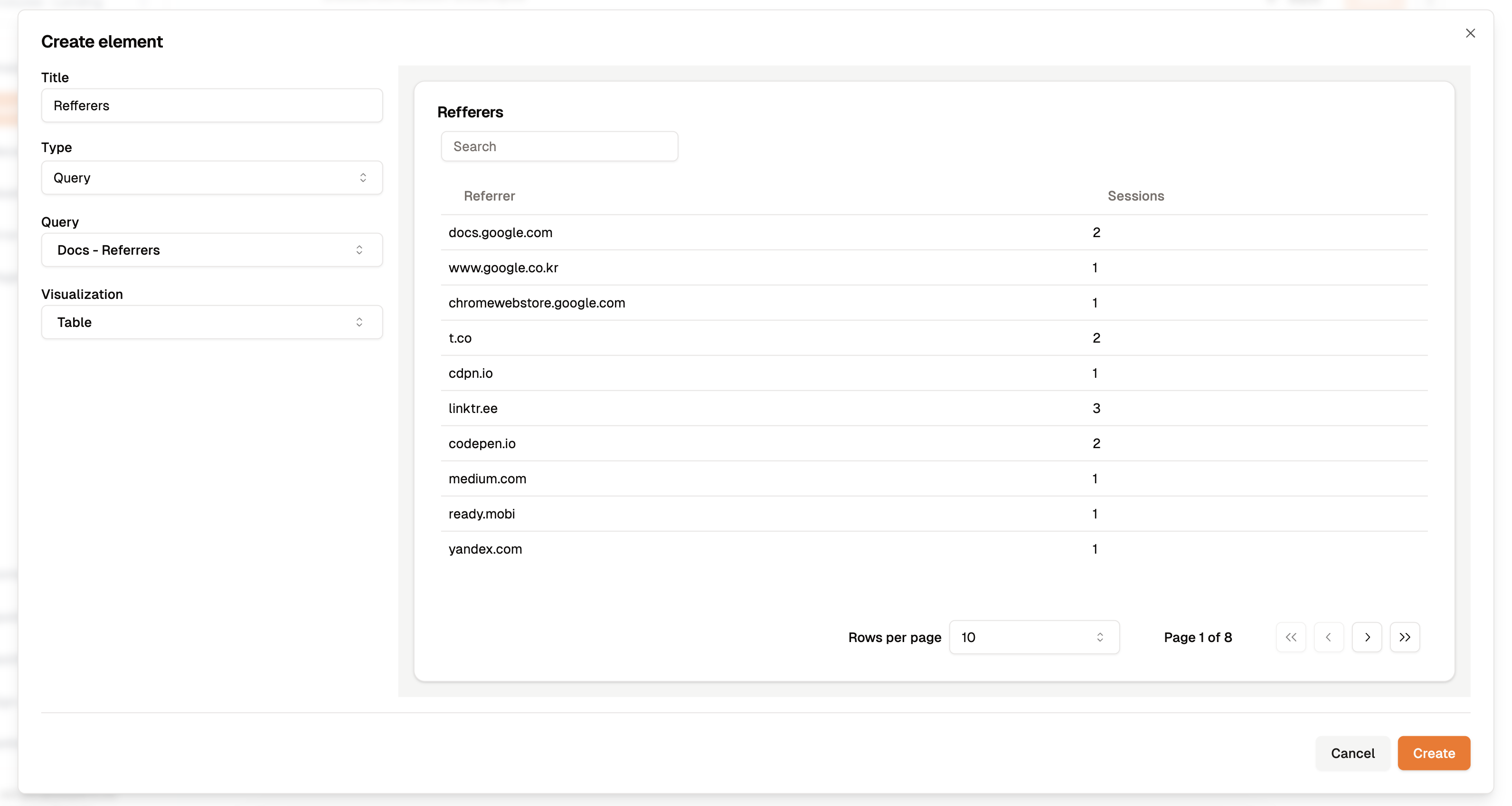
Tables are a great way to present tabular data in a structured format.
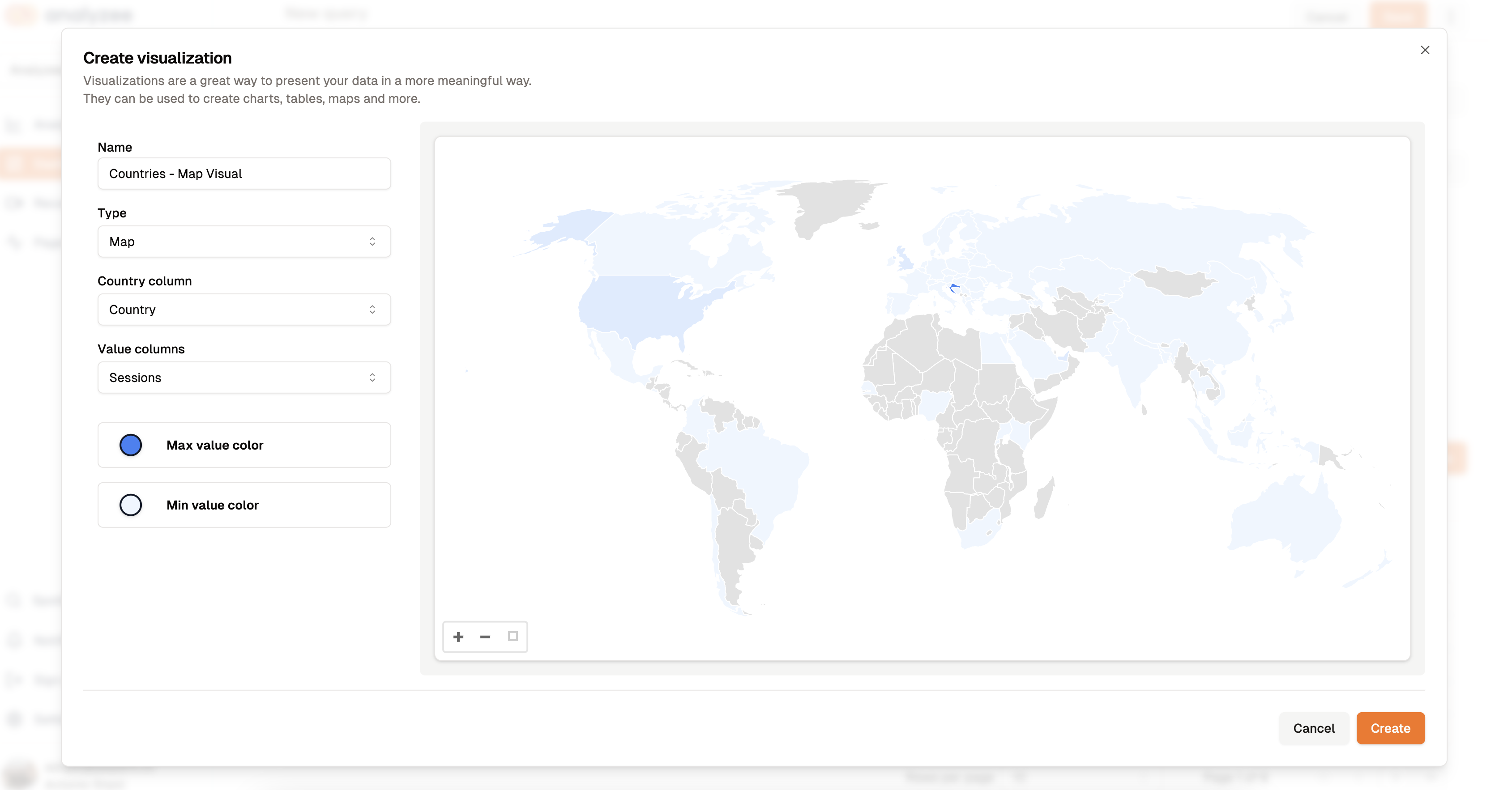
Query #3: Visitors per Country
SELECT
    country as Country,
    COUNT(*) as Sessions
FROM sessions
GROUP BY country
For this query, we'll create a Map visualization to display the number of visitors per country.
Let's add this visualization to our dashboard to show the distribution of visitors across different countries. Same as before, click on "Add Element" in the dashboard and select the "Docs - Countries" from the list of available queries.
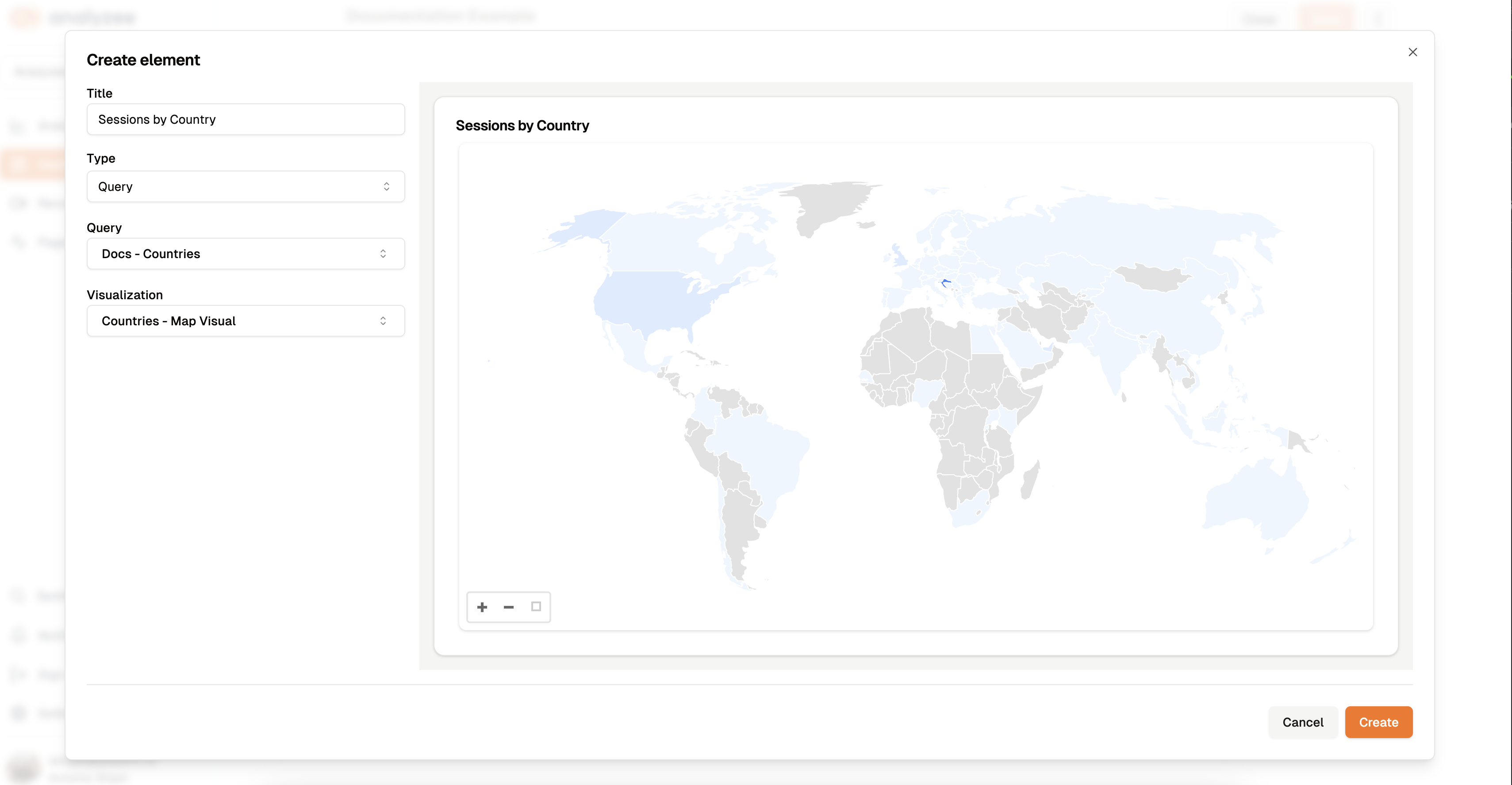
Click on the "Create" button to add the visualization to the dashboard.
Select the three dots on the top right of any visualization to access additional options such as "Edit", "Duplicate", and "Remove".

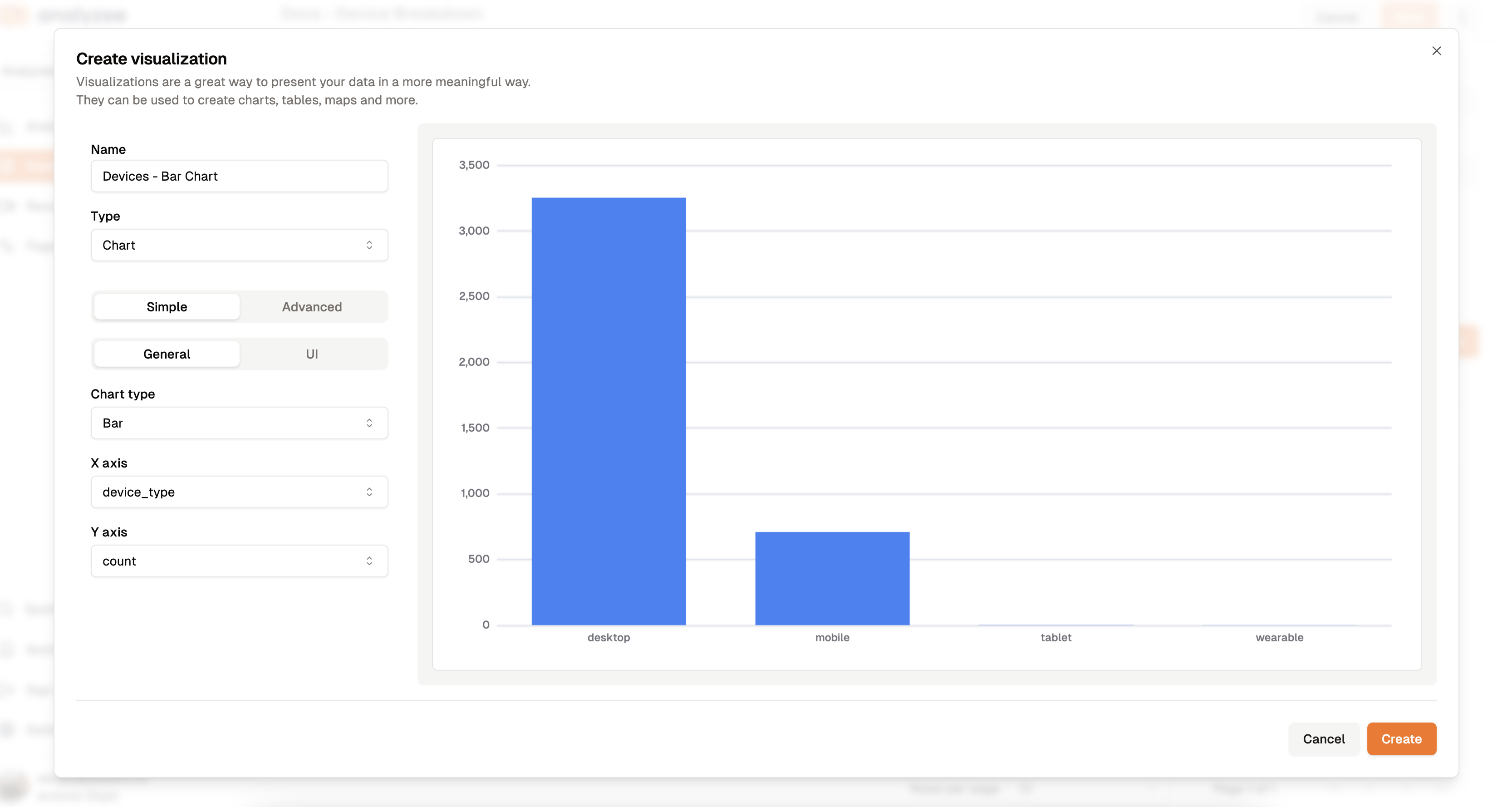
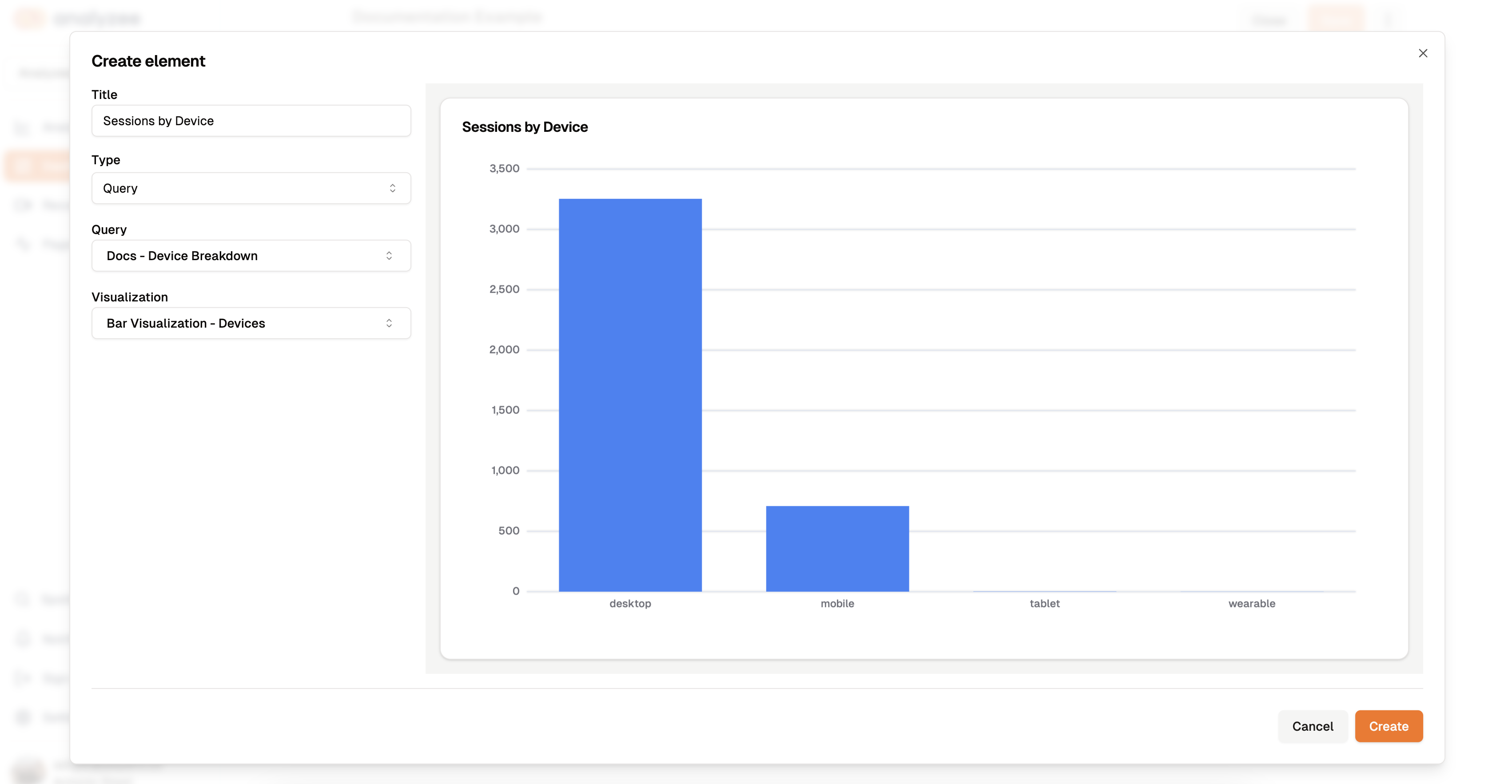
Query #4: Device Breakdown
SELECT COUNT(*) as count, device.type as device_type
FROM analyzee.sessions
GROUP BY device.type
ORDER BY count DESC
For this query, we'll create a Bar Chart visualization to show the breakdown of devices used by visitors.
Just like before, add this visualization to the dashboard by selecting the "Docs - Devices" query and clicking on "Create".
Let's take a look at our dashboard now.
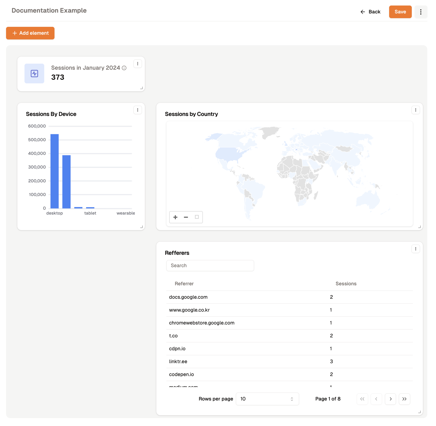
You can continue to add more visualizations and queries to your dashboard to provide a comprehensive overview of your organization's performance. Remember to save your dashboard periodically to ensure that your changes are preserved.
Drag and drop elements to rearrange them on the dashboard canvas. You can also resize elements by clicking and dragging the bottom-right corner of the element.
Congratulations! You've successfully created an overview report dashboard in Analyzee. This dashboard will serve as a valuable tool for monitoring key metrics and making data-driven decisions to drive your organization's success.
We hope this example has been helpful in guiding you through the process of building a custom dashboard in Analyzee. If you have any questions or need further assistance, please don't hesitate to reach out to our support team at support@analyzee.io.