Advanced Visualizations
After writing your SQL query and retrieving the desired data, the next step is to visualize the results for better understanding and analysis. These visualizations are the building blocks for your custom dashboards.
Analyzee uses Apache ECharts for advanced visualizations, which provides a wide range of customization options to create visually appealing and informative visualizations. You can see detailed examples of how to customize your visualizations using javascript code in the ECharts examples.
Accessing Advanced Visualizations
- Query Results: After executing your SQL query, you will see the query results displayed in a tabular format. Go to Queries to learn more about writing queries.
- Visualizations: Click on the
Create visualizationtab to view the available visualization options. - Type Selection: Select the Chart type within the visualization options.
- Advanced Visualizations: Click on the
Advancedoption to access the advanced visualization options. - Customization: Use the code editor to customize the visualization further.
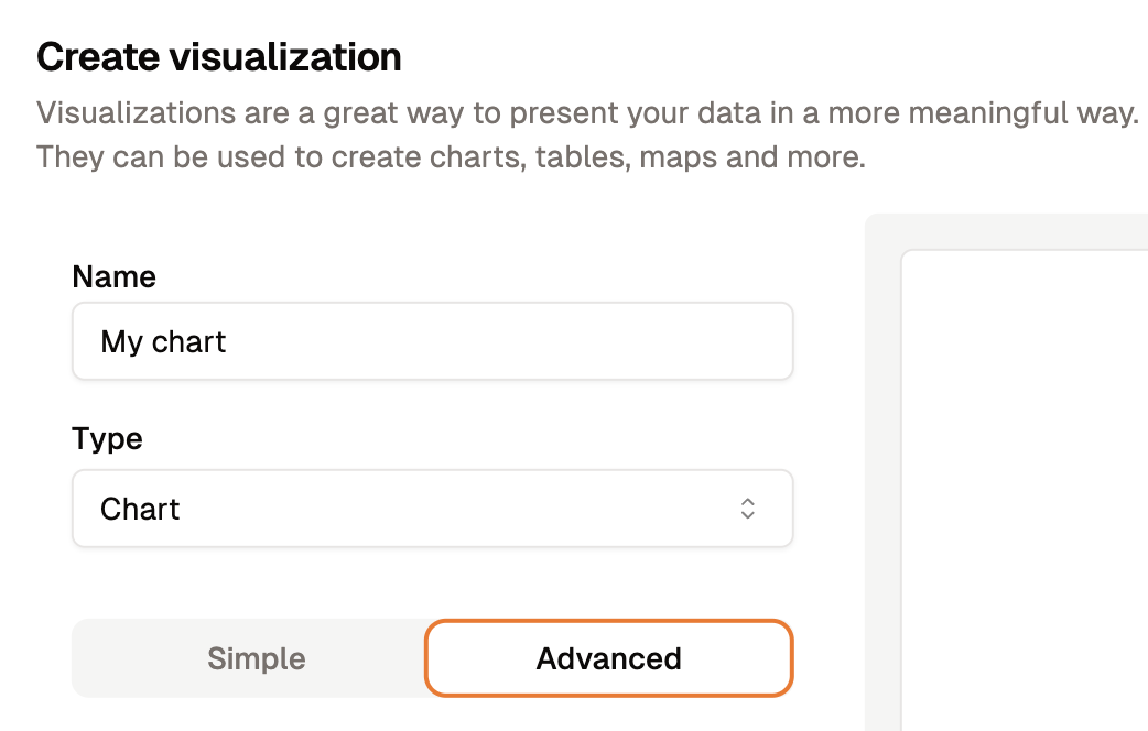
Accessing Advanced Visualizations in Analyzee
Customizing Visualizations
How It Works
The data returned by your query is stored in a variable called data in the code editor.
You can use this variable to create custom visualizations by manipulating the data and defining the chart options.
These options include setting the chart type, defining the data series, configuring the axes, and customizing the appearance of the chart. You can also add additional features such as legends, tooltips, and labels to the visualization.
The Code Structure
The code editor provides a template with sample code to help you get started. The default code structure consists of two main sections:
- The import statement: This section imports the necessary modules and libraries required for creating the visualization.
import type {EChartsOption} from 'echarts';
- The function definition: This section defines the function that generates the chart based on the data and options provided.
function chartOptions(data): EChartsOption {
  // Your code goes here

  return {};
}
The chartOptions function takes the data variable as input and returns an object containing the chart options.
You can edit the code within the function to customize the visualization according to your requirements. The return value of the function should be an object that defines the chart options.
Let's explore what the returned object might look like:
return {
  xAxis: {
    type: 'category',
    data: ['Mon', 'Tue', 'Wed', 'Thu', 'Fri', 'Sat', 'Sun']
  },
  yAxis: {
    type: 'value'
  },
  series: [
    {
      data: [150, 230, 224, 218, 135, 147, 260],
      type: 'line'
    }
  ]
};
You can copy and paste this code into the code editor and modify it to create your custom visualization. So in full, the code editor will look like this:
import type {EChartsOption} from 'echarts';

function chartOptions(data): EChartsOption {
  return {
    xAxis: {
      type: 'category',
      data: ['Mon', 'Tue', 'Wed', 'Thu', 'Fri', 'Sat', 'Sun']
    },
    yAxis: {
      type: 'value'
    },
    series: [
      {
        data: [150, 230, 224, 218, 135, 147, 260],
        type: 'line'
      }
    ]
  };
}
What this code does is create a simple line chart with data points for each day of the week. This example is just a starting point, and you can customize the chart further by modifying the data, axes, series, and other options as needed.
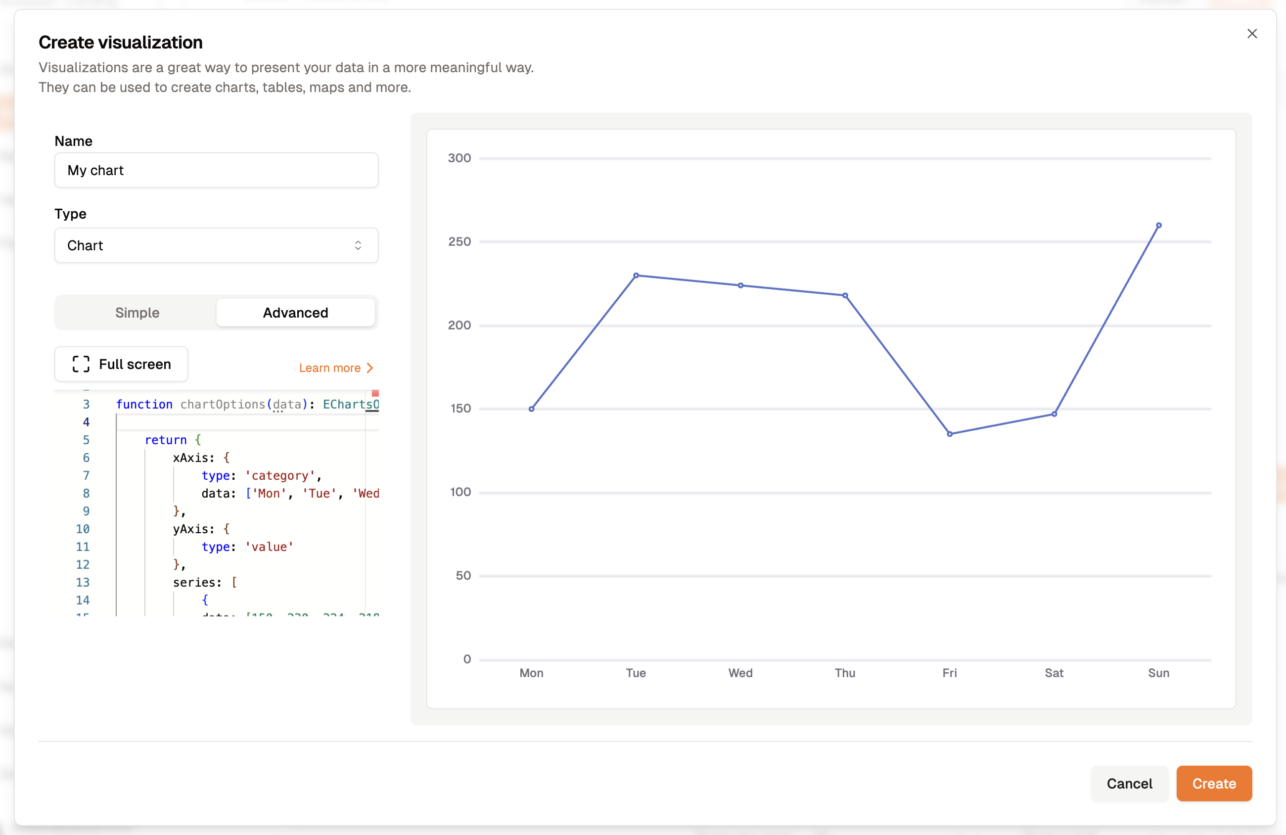
The output of the line chart code
But this data is static, and you will need to replace it with the actual data returned by your query.
Using Query Data in Visualizations
The data variable contains the results of your query.
The raw data is stored in an array of objects, where each object represents a row of the query results. Each object contains key-value pairs, where the keys are the column names and the values are the corresponding data values.
We can use this data to create dynamic visualizations that reflect the actual data returned by the query.
Let's walk through an example to demonstrate how to use query data in visualizations.
Example: Sessions by Country
We will construct a simple query and visualize the results, you can follow along with the example below. If you not yet familiar with queries, you can refer to the Creating and Executing a Query guide.
SELECT
country as Country,
COUNT(*) as Sessions
FROM sessions
GROUP BY country
This query retrieves the number of sessions by country from the sessions table.
By executing this query, you will get a table with two columns: Country and Sessions.
Your query editor should look like this:
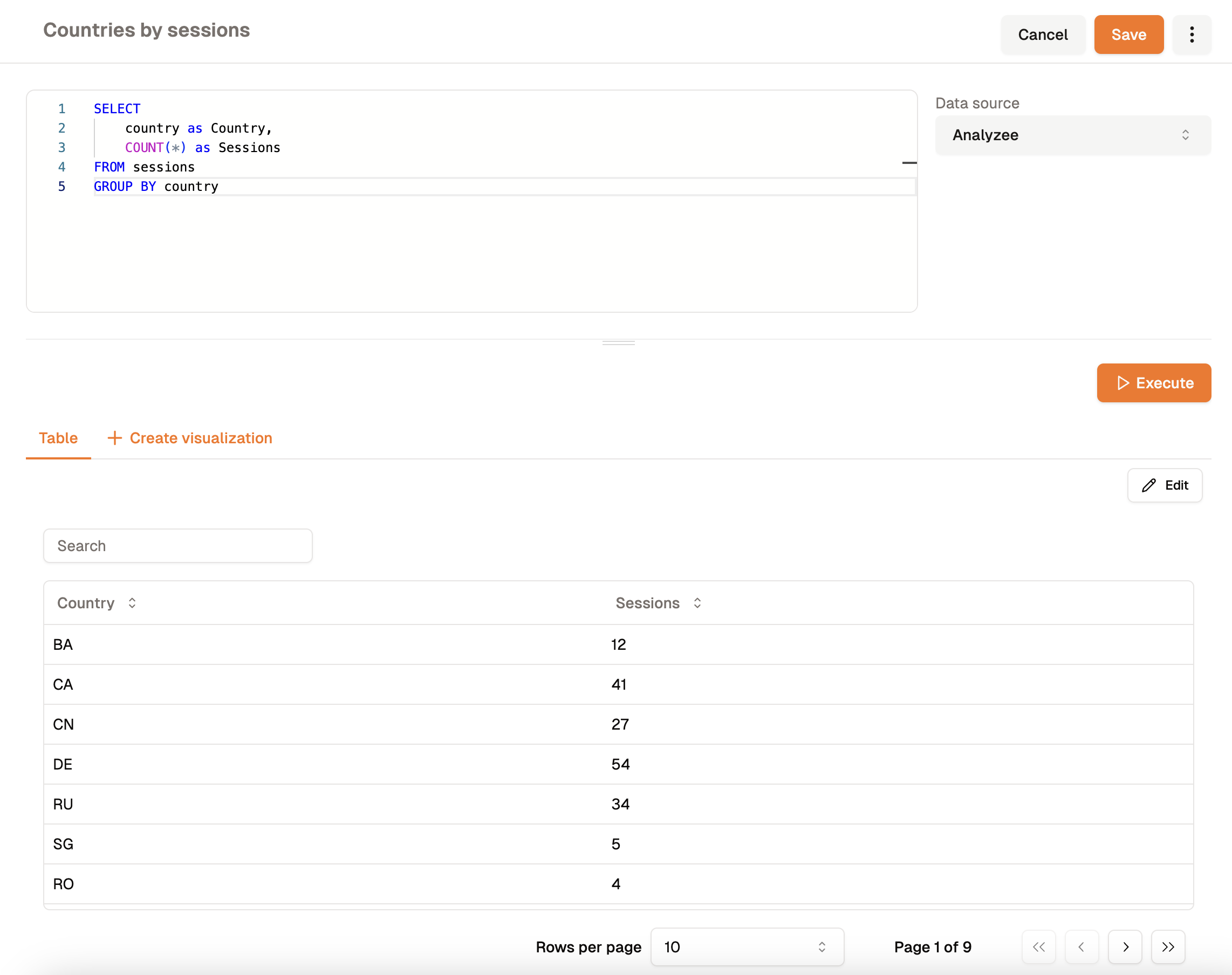
Query Editor with the executed example query
After executing the query, you will see the results displayed in a tabular format.
This same data will be available in the code editor for creating visualizations, in the data variable.
In the background, the data variable looks like this:
[
  {
    "Country": "US",
    "Sessions": 150
  },
  {
    "Country": "CA",
    "Sessions": 230
  },
  {
    "Country": "UK",
    "Sessions": 224
  },
  ...
Now, let's create a simple bar chart to visualize the number of sessions by country.
import type {EChartsOption} from 'echarts';

function chartOptions(data): EChartsOption {
  const xAxisData = data.map(row => row.Country);
  const seriesData = data.map(row => row.Sessions);

  return {
    xAxis: {
      type: 'category',
      data: xAxisData
    },
    yAxis: {
      type: 'value'
    },
    series: [
      {
        data: seriesData,
        type: 'bar'
      }
    ]
  };
}
This code snippet creates a bar chart with the countries on the x-axis and the number of sessions on the y-axis.
The xAxisData and seriesData variables extract the country names and session counts from the data variable, respectively.
You can copy and paste this code into the code editor and execute it to see the visualization.
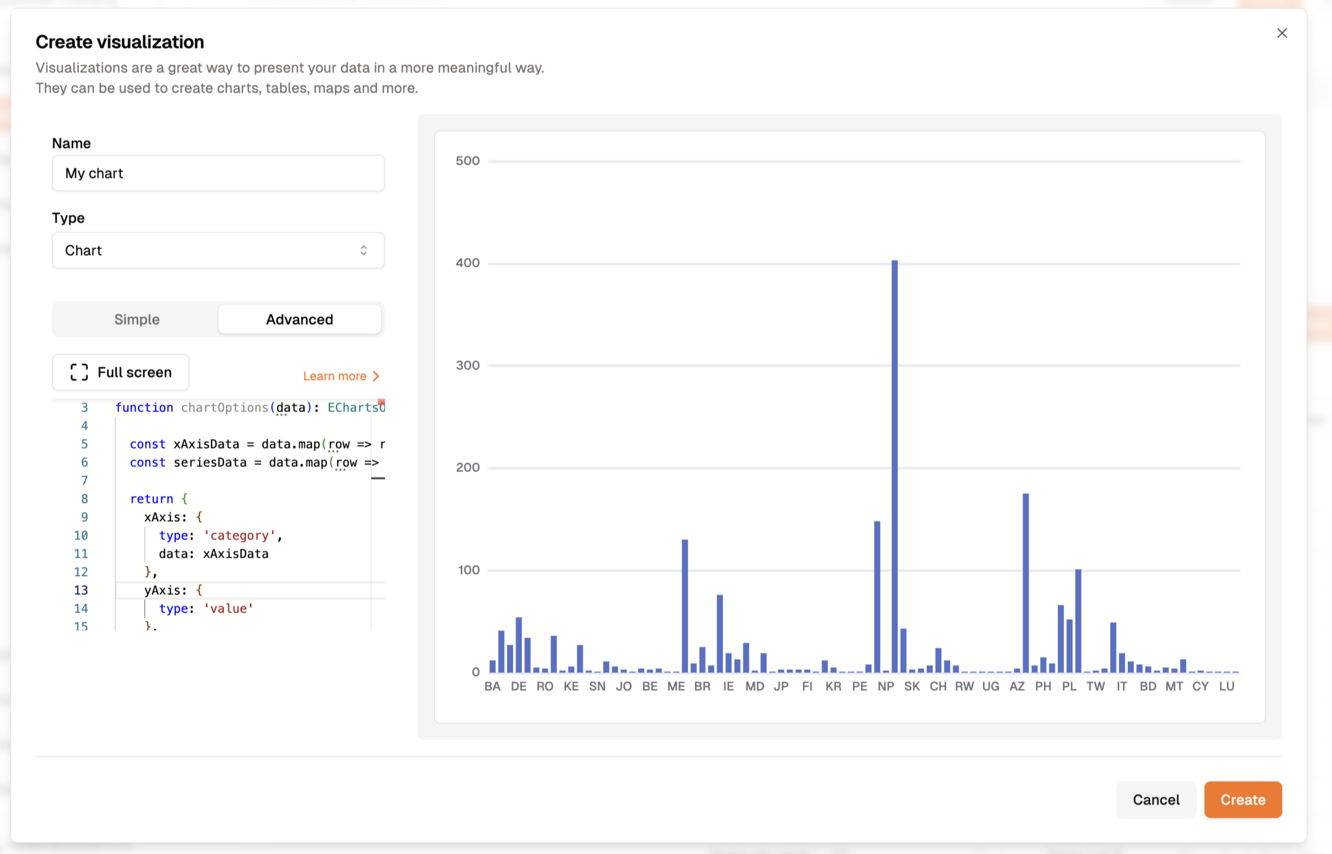
The output of the bar chart code
The Options Object
The chartOptions function returns an object that defines the chart options.
This object contains various properties that configure the appearance and behavior of the chart.
Here are some common properties you can set in the options object:
title: The title of the chart.xAxis: Configuration options for the x-axis.type: The type of the x-axis (e.g., category, value). This is most commonly set to 'category'.data: The data to be displayed on the x-axis, this is an array of values. In the example above, we used the country names.
yAxis: Configuration options for the y-axis.type: The type of the y-axis (e.g., category, value). This is most commonly set to 'value'.
series: An array of series objects that define the data series to be displayed on the chart.data: The data points for the series, this is an array of values. In the example above, we used the session counts.type: The type of the series (e.g., line, bar, pie).
legend: Configuration options for the legend, which displays the series names.
The Series Property
Let's go deeper into the series property, which is an array of series objects.
Each series object defines a data series to be displayed on the chart.
This means you can visualize multiple data series on the same chart.
The data property of the series object contains an array of values that represent the data points for the series.
This array should correspond to the x-axis data, and each value should align with a specific category on the x-axis.
The length of the data array should match the length of the data array in the x-axis configuration.
The type property specifies the type of the series, such as line, bar, or pie.
The data object can change based on the type of series you choose.
Go to the ECharts documentation about chart types to see detailed examples of different chart types and their configurations.
This specific link shows the configuration options for a pie chart.
For any other chart type, go to the sidebar, select the series tab, and choose the chart type you want to explore.
Within the chart type, you will find the data property and its configuration options.
Here is an example of a line chart with multiple data series:
{
  title: {
    text: 'Stacked Line'
  },
  legend: {
    data: ['Email', 'Union Ads', 'Video Ads', 'Direct', 'Search Engine']
  },
  xAxis: {
    type: 'category',
    data: ['Mon', 'Tue', 'Wed', 'Thu', 'Fri', 'Sat', 'Sun']
  },
  yAxis: {
    type: 'value'
  },
  series: [
    {
      name: 'Email',
      type: 'line',
      stack: 'Total',
      data: [120, 132, 101, 134, 90, 230, 210]
    },
    {
      name: 'Union Ads',
      type: 'line',
      stack: 'Total',
      data: [220, 182, 191, 234, 290, 330, 310]
    },
    {
      name: 'Video Ads',
      type: 'line',
      stack: 'Total',
      data: [150, 232, 201, 154, 190, 330, 410]
    },
    {
      name: 'Direct',
      type: 'line',
      stack: 'Total',
      data: [320, 332, 301, 334, 390, 330, 320]
    },
    {
      name: 'Search Engine',
      type: 'line',
      stack: 'Total',
      data: [820, 932, 901, 934, 1290, 1330, 1320]
    }
  ]
};
Paste this object into the editor to get the output below:
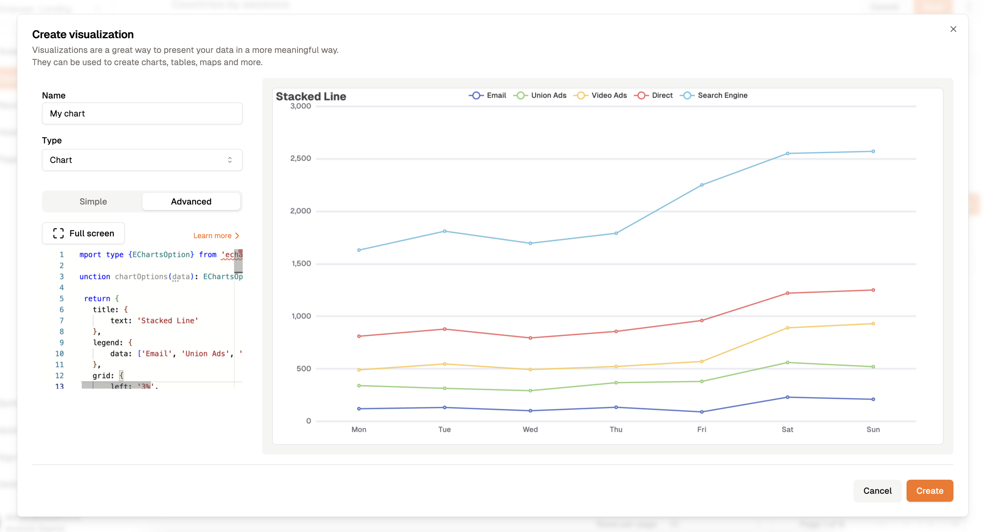
The output of the multiple line chart code
This example shows a stacked line chart with five data series representing different sources of traffic. Each series is displayed as a line on the chart, and the legend shows the names of the series.
Multiple Data Series
If your query returns multiple data series, you can use this structure to visualize them in a single chart. For example, you could compare sales data by region, product category, or time period using a similar approach.
Let's say your query returned data that looks like this:
[
  {
    "Region": "North",
    "Sales": 150,
    "Expenses": 100
  },
  {
    "Region": "South",
    "Sales": 230,
    "Expenses": 180
  },
  {
    "Region": "East",
    "Sales": 224,
    "Expenses": 200
  },
  ...
You could create a chart that visualizes both sales and expenses by region using the series property to define multiple data series.
Your chartOptions function would look like this:
import type {EChartsOption} from 'echarts';

function chartOptions(data): EChartsOption {
  const xAxisData = data.map(row => row.Region);
  const salesData = data.map(row => row.Sales);
  const expensesData = data.map(row => row.Expenses);

  return {
    xAxis: {
      type: 'category',
      data: xAxisData
    },
    yAxis: {
      type: 'value'
    },
    series: [
      {
        name: 'Sales',
        data: salesData,
        type: 'line'
      },
      {
        name: 'Expenses',
        data: expensesData,
        type: 'line'
      }
    ]
  };
}
Example: Pie Chart
Let's create a pie chart to visualize the distribution of sessions by country. You can follow along with the example below.
SELECT
    browser.name as Browser,
    COUNT(*) as Sessions
FROM sessions
GROUP BY Browser
This query retrieves the number of sessions by browser from the sessions table.
By executing this query, you will get a table with two columns: Browser and Sessions.
Your query editor should look like this:
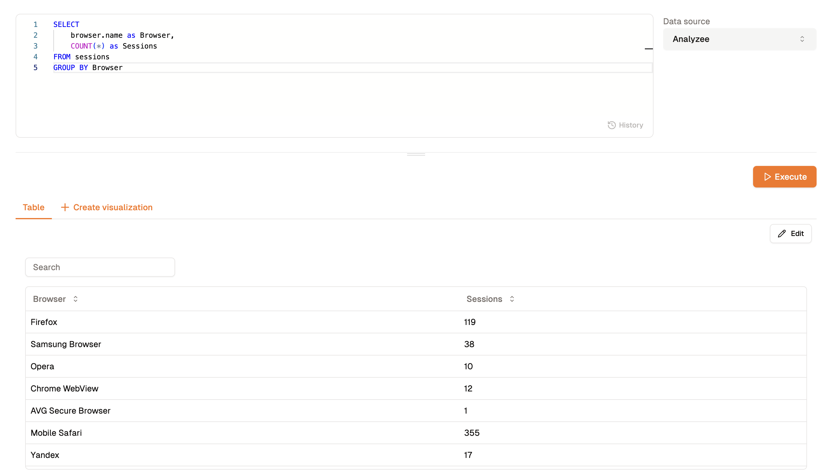
Query Editor with the executed example query
After executing the query, you will see the results displayed in a tabular format.
This same data will be available in the code editor for creating visualizations, in the data variable.
Now, let's create a pie chart to visualize the distribution of sessions by browser.
As mentioned earlier, the data property of the series object can change based on the type of series you choose.
For a pie chart, the data property should be an array of objects with name and value properties.
What happens if I don't set the name property? If you don't set the name property, the pie chart will not display the labels for the slices. The name property is used to display the labels, so it is essential to include it in the data object.
import type {EChartsOption} from 'echarts';

function chartOptions(data): EChartsOption {
  /**
   * Transform the data into the format required for a pie chart
   * The data property of the series object should be an array of objects with name and value properties
   * For example: [{name: 'Chrome', value: 150}, {name: 'Firefox', value: 230}, ...]
   */
  const seriesData = data.map(row => ({name: row.Browser, value: row.Sessions}));

  return {
    series: [
      {
        type: 'pie',
        data: seriesData
      }
    ]
  };
}
This code snippet transforms the query data into the format required for a pie chart.
You can copy and paste this code into the code editor and execute it to see the visualization.
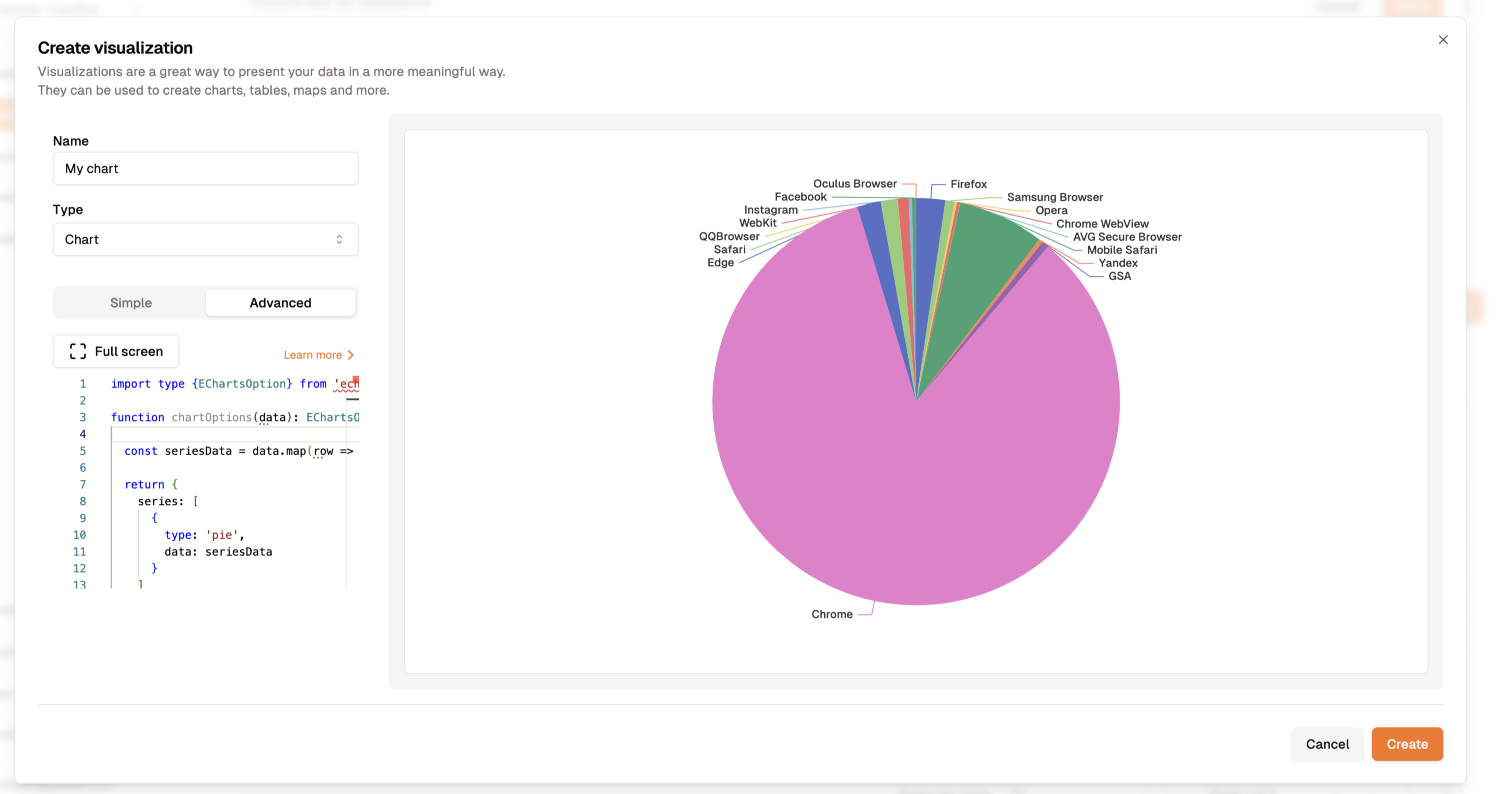
The visual output of the pie chart code
Check out the ECharts pie chart example for more configuration options.