Visualizing Query Results
After writing your SQL query and retrieving the desired data, the next step is to visualize the results for better understanding and analysis. These visualizations are the building blocks for your custom dashboards.
Choose a Visualization Type
- After executing your query, the query results will be shown on the screen.
- By default, the results are displayed in a table.
- Click the "Create Visualization" button to choose the type of visualization you want to create.
- Determine the most suitable visualization type based on the nature of your data and the insights you want to convey. Common visualization types include:
- Line charts
- Bar graphs
- Pie charts
- Tables
- Maps
Visualization Tools
- After selecting the "Create Visualization" option, you will be presented with a range of visualization tools to choose from.
- Give your visualization a name and select the type of visualization you want to create.
- This name will be displayed below your query for easy reference.
Visualization Type
- Analyzee offers 4 types of visualizations:
- Table
- Chart
- Map
- Single Value
- By selecting the appropriate visualization type, you can effectively represent your query results in a clear and informative manner.
Choose any type and customize it according to your requirements. For example, if you want to visualize trends over time, a line chart may be the most suitable option. If you're comparing different categories or groups, a bar graph or pie chart could be more appropriate. For geographical data, a map visualization can provide valuable insights. For single value metrics, a single value visualization can highlight key performance indicators (KPIs). Select the visualization type that best aligns with your data and analysis objectives.
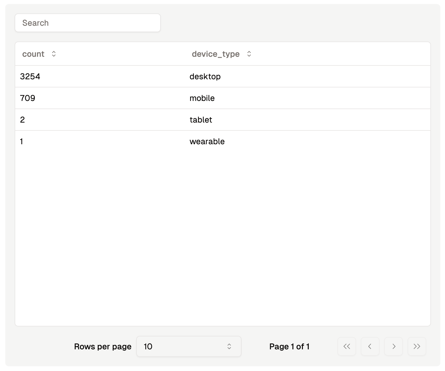
Table Visualization
- The table visualization displays your query results in a tabular format, making it easy to view and analyze the data.
- Customize the table by selecting the columns to display, sorting the data, and applying filters to focus on specific subsets of data.

Table Visualization
Chart Visualization
- The chart visualization transforms your query results into visual representations such as line charts, bar graphs, or pie charts.
- After selecting the chart type, additional options will appear. These options allow you to customize the chart by selecting the X-axis and Y-axis fields, setting the chart title, and adjusting the chart style.
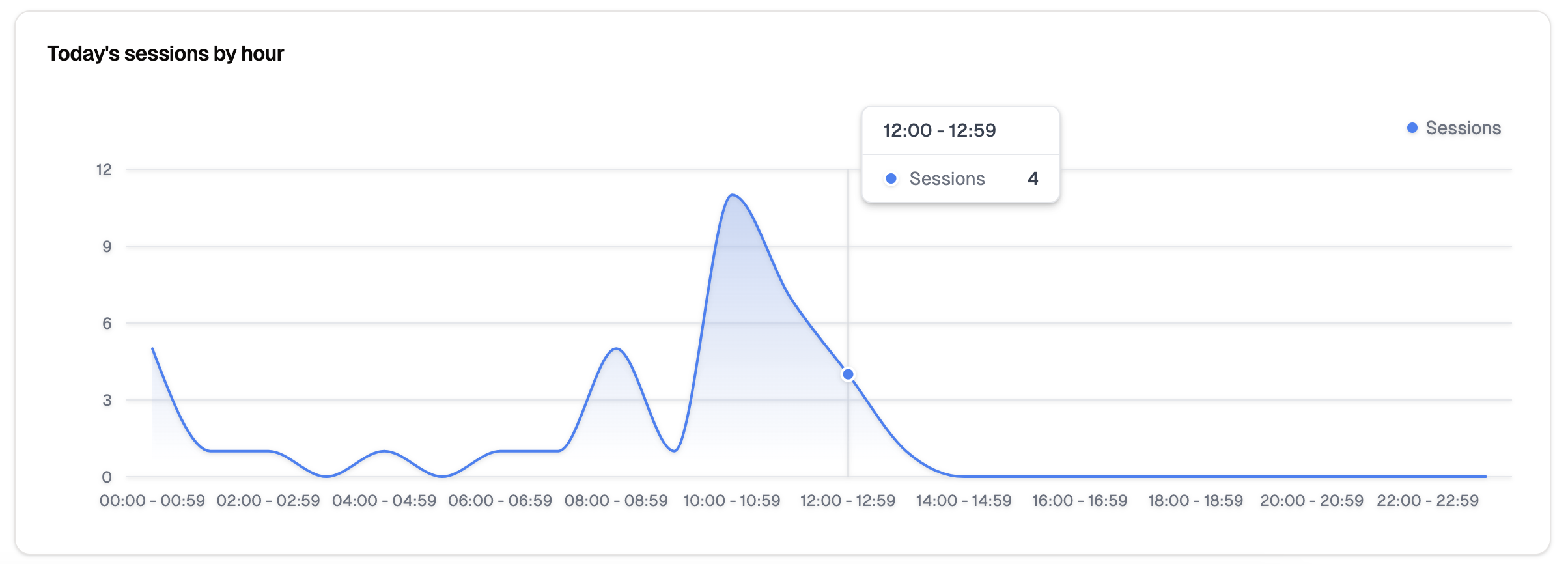
Line Chart
- Line charts are ideal for visualizing trends over time or comparing multiple series of data.
- Customize the line chart by selecting the X-axis and Y-axis fields, setting the chart title, and adjusting the chart style.

Line Visualization
Bar Graph
- Bar graphs are effective for comparing different categories or groups of data.
- Customize the bar graph by selecting the X-axis and Y-axis fields, setting the chart title, and adjusting the chart style.
Pie Chart
- Pie charts are useful for displaying the distribution of data across categories or groups.
- Customize the pie chart by selecting the category field and value field, setting the chart title, and adjusting the chart style.
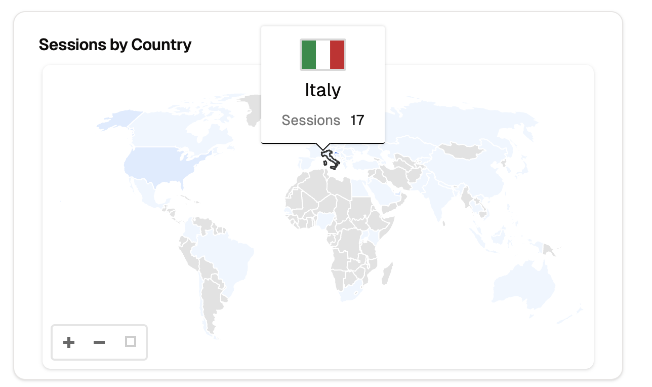
Map Visualization
- The map visualization displays geographical data on an interactive map, allowing you to visualize spatial relationships and patterns.
- Customize the map by selecting the location field, value field, and map style.

Map Visualization
Single Value Visualization
- The single value visualization highlights key performance indicators (KPIs) by displaying a single metric or value.
- They are usually the headline numbers that summarize the most critical aspects of your data.

Single Value Visualizations
Advanced Customization
- Analyzee provides advanced customization options for each visualization type, allowing you to tailor the appearance and behavior of your visualizations.
- After receiving the query results, you can edit them using javascript code to customize the visualization further.
- This feature enables you to create highly personalized visualizations that meet your specific requirements.
- You can also use the tools provided to adjust the visualization's appearance, such as changing colors, labels, and data formatting.
Analyzee uses Apache ECharts for visualizations, which provides a wide range of customization options to create visually appealing and informative visualizations. You can see detailed examples of how to customize your visualizations using javascript code in the ECharts examples.
By following these steps, you can effectively visualize the results of your SQL query in Analyzee, enabling you to gain valuable insights and make informed decisions based on your data analysis.